Yesterday, I added the ability for admins to view, create, and edit categories. This meant I needed to display columns of categories, organized by category type (think of it as meta-categories) – just what I had done on the home page, but without the extra column to deal with.
The code I’d written to generate the columns on the home page was seriously ugly, and there was no way I wanted to copy it into *another* controller. Nope. This was a time to stay DRY.
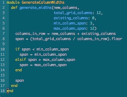
So, I made a module, and refactored the heck out of the code – resulting in what you see above. Instead of more than 30 lines of eeeek!, it’s now 18 lines that you can actually read:
https://github.com/liantics/gph/blob/master/lib/generate_column_widths.rb
Here’s How it Works:
In Bootstrap 3, columns are arranged in rows. Each row has a certain maximum number of columns in it. The default is 12.
The columns in a row can be divided into sections, using a “col-” css class that indicates how many of those 12 columns you want to use for each section of content within the row.
The css class also indicates the smallest screen size on which to apply that class. Any device with a screen below that size will default to using all 12. Everything above that size will use the number you specify. (You can specify for multiple sizes, too, but I’ll leave that to the bootstrap docs).
So, if you want your 12 columns divided evenly into 4 sections, you’d use a span of “3”: which means you want each section take up 3 of the 12 columns. Dividing the 12 columns by the span indicates how many sections you’ll end up with. In this case, 12 / 3 = 4, so the row will be divided into 4 sections.
In your html, the css class to make 4 even columns for all screen sizes, from size small (tablet) on up, would look like this:
col-sm-3
“col” = define a column span
“sm” = define the screen size at which to start using this span
“3” = the number of columns to use for this section.
In a div on your page, it would look like:
<div class="col_sm_3">
So far, so good!
What To Do About Empty Columns?
But what if you won’t know how many columns you’re going to need until you do some other calculation (like in my case, I have no idea if there will be any projects in a given meta-category), and you don’t want to display any empty columns?
The Default Solution is Ugly
The default solution is to pick the maximum number of columns, programmatically don’t show any columns that are empty, and do some css magic to align things. But I don’t like that, because you end up with clumps of unnecessary css alignment divs all over your code. I hate having to add a bunch of nested divs in order to make things align.
What If the Server Could Do It?
I thought what if, instead, the server could figure that stuff out all on its own, and automatically re-size columns based on what’s needed in a given spot at a given time. Even more important, on one page, I needed an extra column of data to co-exist alongside the meta-categories.
So the problem is even bigger than not knowing how many columns I’m going to have, but not necessarily knowing how many I need them to fit alongside. In the case of the home page, from the user’s perspective, the extra column (“projects near the finish line”) is just another meta-category for projects, but from the system’s perspective, it’s something completely different, calculated separately based on the number of donations a project has received, and it needs to fit nicely with the auto-generated category columns.
What I wanted to be able to do from the controller was generate the column span value, based on:
- The number of new columns I was adding to the view
- The number of columns that the new columns would have to share space with
- The minimum span size (the number to divide into the total number of columns)
- The maximum span size (essentially, this is what to do if there’s only one column)
- The total number of columns available – in case I decided to use a grid that wasn’t 12 columns wide in the future. I’ve used 9 in the past.
From a code perspective, in the controller, this is roughly what I needed to be able to specify:
 @column_span = generate_a_span(

        number_of_new_columns,

        total_columns_in_row,

        number_of_existing_columns_if_any,

        minimum_span_size,

        maximum_span_size

    )
And in the view, I’d use something like:
<div class="col-sm-<%= @column_span %>">
But …
Specifying All Those Vars Every Time Would Be Annoying
I didn’t want to have to specify every single variable every time. Most of the time, everything but the number of new columns would be entirely optional, because I’d want 4 columns on most pages, and I’m not likely to change the grid size willy-nilly. This meant making all but one variable optional, and defining defaults for the rest.
The result:
def generate_widths(new_columns,

                        total_grid_columns: 12,

                        existing_columns: 0,

                        min_column_span: 3,

                        max_column_span: 12

                  )
In my controller for the home page, I have:
@column_width = Category.new.generate_widths(

        @category_types_count, existing_columns: 1

    )
This handles the new columns I’m creating based on the number of category types in use (@category_types_count) as well as the one existing column generated from another source (existing_columns: 1).
Since I’m using the defaults for total grid columns, the minimum column span, and the maximum column span, I don’t have to specify those.
In my controller for the categories display page for admins, I have:
@column_width = Category.new.generate_widths(@category_types.count)
Since I don’t have to accommodate columns generated by other sources, I need only specify the number of new columns I’m adding, thus I can skip the “existing_columns” specification.
In both views, I have:
<div class="col-sm-<%= @column_width %>">
That’s it.
All I had to do was include the module in my category model.
Extra Cool
The extra cool thing: this can be used for any grid system that uses a numeric value in the css class strings in the view.


